
E-commerce Integration :
Rebuilding Penn Tour’s Digital Experience
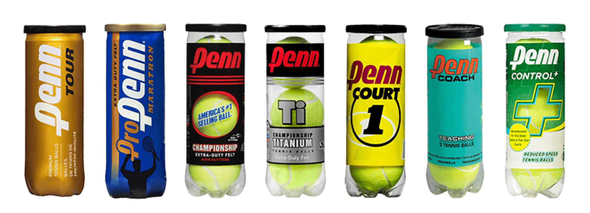

Penn Tour is a leading tennis brand that, despite its strong presence, lacked an e-commerce platform. As part of an academic project in collaboration with real clients and stakeholders, we were tasked with designing both a website and mobile experience to bring the brand online and connect directly with consumers.
Team
Juhi
Nagendra
Ben
Role
UX Research
Information Architecture
UI/Visual Design
Client Collaboration
Responsibilities
User Research
Prototyping
Usability Testing
Business strategy
Tools
Figma
Notion
Miro
Teams
Timeline
Aug 23-
Dec 23
Project Context
We discovered a major gap—Penn Tour, a leading tennis brand, lacked e-commerce. After speaking with real users, it became clear they wanted a direct way to buy products online.
Our goal wasn’t just to add a checkout flow, but to rethink the site’s information architecture, customer journey, and business potential. We approached the project as problem-solvers, aiming to drive both sales and customer retention through thoughtful design.
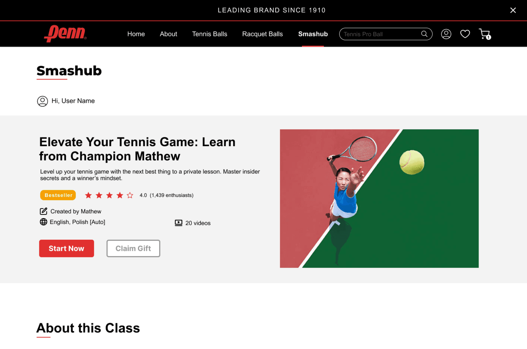
Snippet of rentention strategy
Design System Life Cycle
WEBSITE INCONSISTENCIES
INITAL STEPS
AGILE DESIGNING
FULL CYCLE PROCESS
TIME CONSTRAINTS
DISCOVERY AND AUDIT
BAYMARD ANALYSIS
IDENTIFY PAIN POINTS
DOCUMENTATION
INTEGRATION
ADOPTION
GORVERNANCE
The Challenge
How might we enable customers to easily purchase Penn Tour products directly from the website while providing a clear, intuitive structure for product discovery?
Research
We started by talking to real customers where Penn Tour products are actually bought—at Target, Walmart, and Dick’s.
Over 2 weeks, we did 10 short semi structured interviews asking people how they feel about buying from third-party retailers versus directly from Penn Tour.
We also asked the users to take a quick look at their original website.
What we found-
Many shared frustrating experiences with third-party sellers, from incorrect orders to doubts about authenticity. Everyone preferred the idea of buying directly from the brand.
We had users try the current Penn Tour website, and the feedback was consistent—confusing layout, no clear categories, and an overall frustrating experience. A quick heuristic review using Baymard guidelines confirmed the need for major improvements.
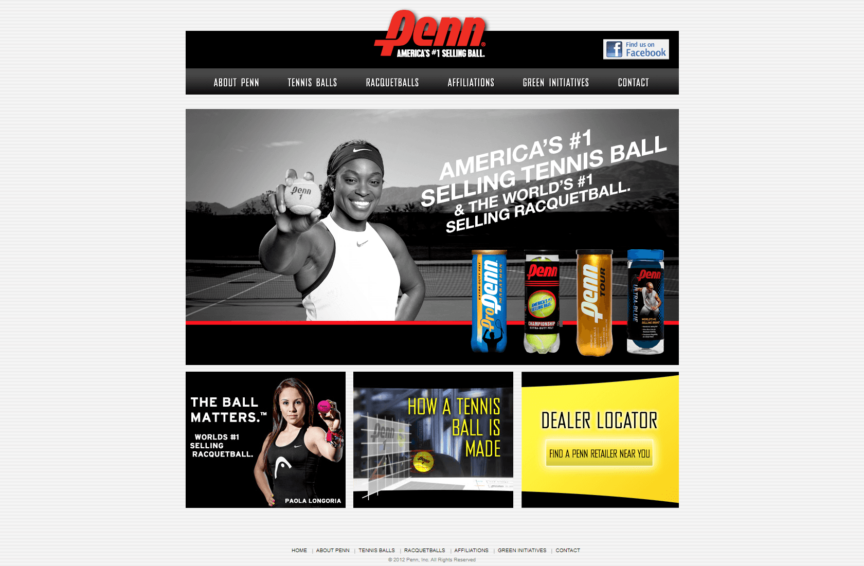
Current Website: lacks e-commerce
Research Findings
After synthesizing our research, we identified three critical areas that needed attention:
Seamless Purchase Flow
Introducing a structured and direct purchasing checkout flow
Improved Information Architecture
Redesigned the site structure to improve product discovery, guided by competitive analysis and insights into what users expect from similar brands.
Acquisition & Retention Strategies
Since Penn Tour relied on third-party sales, we focused on redirecting traffic to the official site through incentives like exclusive offers and loyalty rewards.
Design Outcome
Guided by our How Might We statement, we applied Jesse James Garrett’s Five Planes of UX—from abstract strategy to concrete interface—to shape a thoughtful e-commerce experience for Penn Tour.
Strategy:
We defined both user and business goals based on research insights, focusing on trust, ease of purchase, and brand control.
Scope:
Using a prioritization matrix, user journeys, and competitive analysis, we identified key features aligned with acquisition and retention strategies.
Structure:
We focused on improving the information architecture. Using affinity mapping and open card sorting, we created meaningful product categories and navigation patterns.
Skeleton:
Wireframes were built with a strong layout, consistent design system, and a streamlined checkout flow—including SaaS integration for future scalability.
Surface:
Visual design elements were aligned with Penn’s existing brand identity—refining colors, typography, and buttons for a polished, trustworthy UI.
Five Planes of UX by Jesse James Garrett
SURFACE
VISUAL DESIGN
SKELETON
WIREFRAMES, NAVIGATION DESIGN
STRUCTURE
INFOMATION ARCHITECTURE, INTERACTIVE DESIGN
SCOPE
FUNCTIONAL & CONTENT REQUIREMENTS
STRATEGY
USER GOALS, BUSINESS GOALS
CONCRETE
ABSTRACT
USER EXPERIENCE
UI DESIGN

Old Website
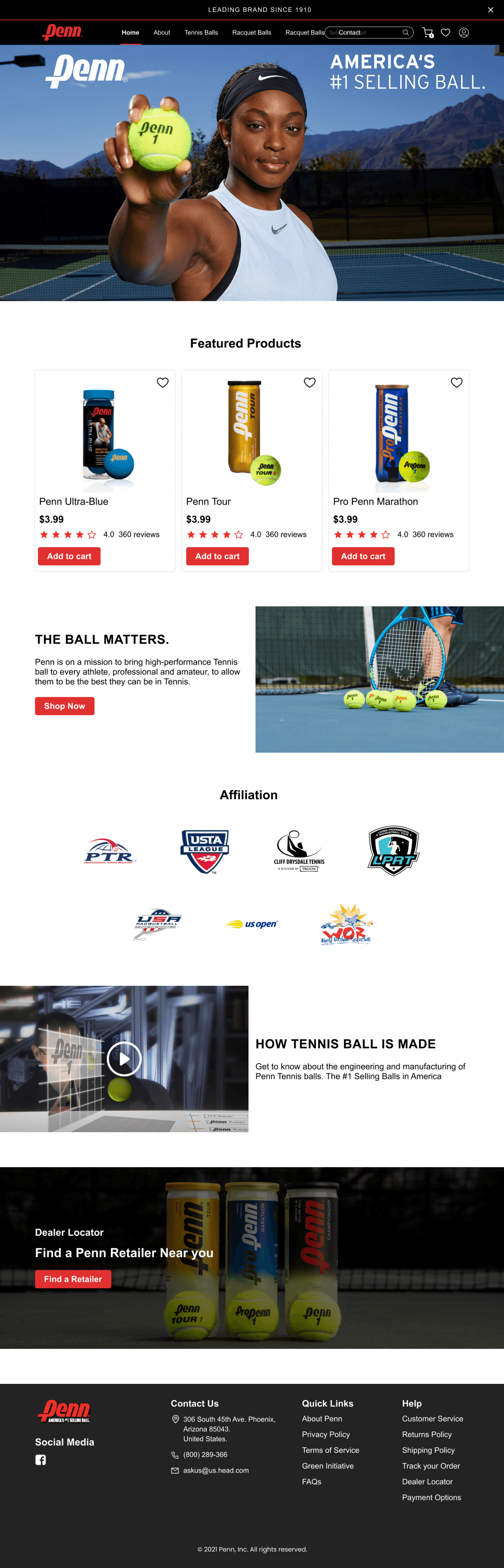
Redesigned Website
Before & After UI Comparison
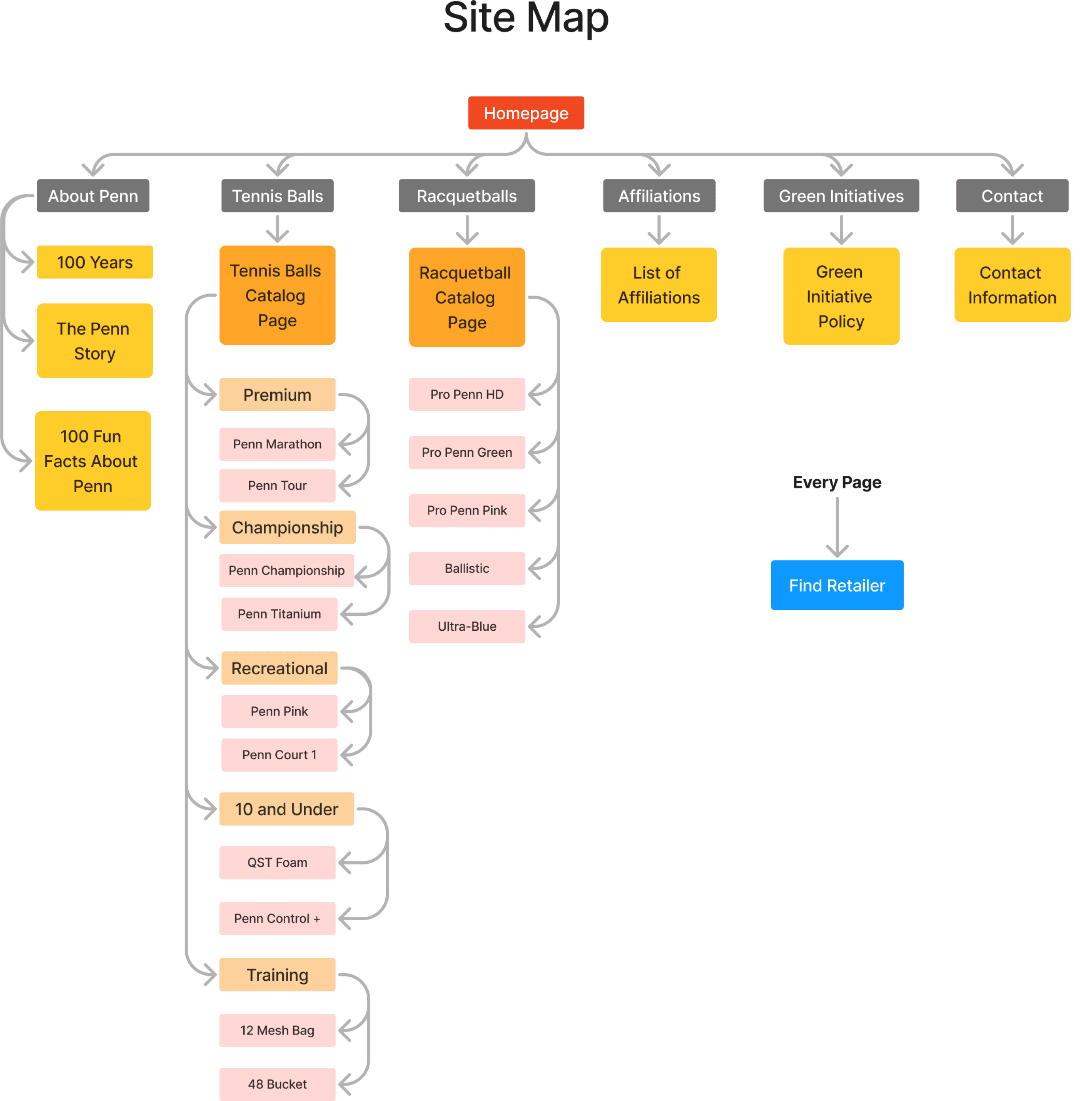
Redesigned the site structure to improve product discovery, guided by competitive analysis and insights into what users expect from similar brands.
Improved Information Architecture
Redesigned the site structure to improve product discovery, guided by competitive analysis and insights into what users expect from similar brands.

Acquisition & Retention Strategies
Since Penn Tour relied heavily on third-party retailers, we focused on redirecting traffic to the official site and building long-term user relationships. Our approach combined immediate incentives with deeper brand engagement.
Acquisition
Implemented an exit-intent pop-up offering 10% off to convert hesitant users and build a mailing list
Designed exclusive web-only offers to create urgency and give users a reason to shop directly from Penn Tour
Retention
Introduced the idea of a “Penn Learn & Coach” platform, helping players connect with coaches and improve skills—extending the brand beyond just products
Planned for replenishment reminders and educational content to keep users engaged between purchases
Learnings & Opportunities
This project gave me the chance to work through the full cycle of product thinking—from research and strategy to designing for both user needs and business goals. I learned how to:
Translate user pain points into structured, meaningful design decisions
Apply UX frameworks (like the Five Planes of UX) to create a solution that feels both intuitive and scalable
Consider acquisition and retention not just as metrics, but as design opportunities
Since this was a hypothetical project, it didn’t go live—but it opened up valuable questions.
If given the chance to continue, I’d love to engage with stakeholders directly, understand their long-term vision for the brand, and align design efforts with measurable impact—bridging the gap between user experience and business success.

This is the portfolio-friendly version.
Want the full plot, deleted scenes, and everything I overthought at 2 a.m.?
👉 [Here’s the director’s cut.]